Final Evaluation For Enterprise Module
- mumtasali
- May 18, 2022
- 8 min read
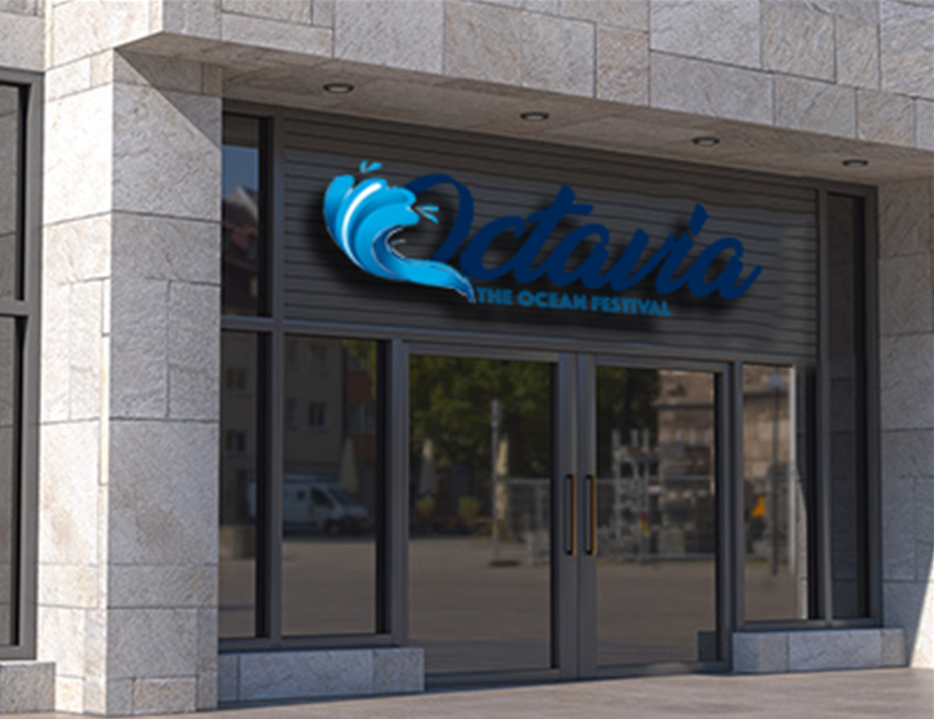
For the logo we had a brief idea of what we wanted so we explored the waves and water splashing themes using vectors designed in illustrator.
We were also exploring different fonts and the different perception different fonts can give to the whole brand image. After we discussed it we decided that we quiet liked the wave vectors with the cursive writing so the second and third row. However, we wanted to develop it more and perhaps experiment more with the placement of the waves. After all the logo ideation and logo developments we tried to experiment with how the waves would look confined in a circle at first. After we tried to use the "O" in Octavia to see if it would give a different perception to our brand image. We experimented with different placements, but we decided that the wave on the "O" looks the most aesthetically pleasing. In the end we ended up changing the colour of the logo from black to blue which made a lot more sense as it linked back to the ocean theme, and it looked more aesthetically pleasing as well.
At first, we did not know which direction to take it so we tried having the logo in the background with the opacity lowered however it did not look aesthetically pleasing and did not fit the aesthetic of our company. After that we tried to incorporate the wave into the design and perhaps have it on the left giving the splash effect however it seemed to basic and we wanted something more unique. So we decided to use the wave but in a bubble and have that run as the theme. You will see that we keep this theme consistent throughout the rest of the module. After we decided on the theme that we wanted to have of the waves in the bubbles. We decided to decrease the opacity so that the main focus of the tickets is the information and that it is not overpowered by colour. As you can see the final ticket has a barcode on it and its put together with the opacity being lower than the previous one. I like that the final focus of the ticket is the information however it looks fun unique and aesthetically pleasing. We made sure to stick with the theme of the colour blue which links back to the sea and ocean theme of the festival. Once we developed the regular ticket design we wanted to work on the VIP tickets. Our main focus was to have that luxury feel for VIP and let customers feel like they have their moneys worth with the unique and exclusive design for VIP. For the designs we started with the regular pass as the foundation and built up from there. At first we wanted to keep it very simple and we added a "VIP" on the ticket however we decided that it looks too similar to the regular one and it does not feel luxurious or exclusive. We also changed the typography because it looked quiet childish at the start. After some consideration we decided to change the whole design up. We kept the waves and bubbles effect to keep it consistent but we branded the VIP tickets with this beautiful royal blue colour. We made it a gradient and it gave this beautiful exclusive and luxurious feel to the ticket which is what we wanted. In conclusion the tickets turned out really well and i am very happy with the final outcome. I think the designs keep the fun , unique and exclusive feel of the brand which is what we wanted originally. I think the tickets allowed us to develop the rest of our designs even further because it allowed us to focus on what the key values of our brand are.
Since we did a regular and VIP tickets we wanted to keep it consistent and do the same for the wristband so it gives VIP a FastTrack giving them the feeling of exclusivity and luxury. We wanted to keep the consistency, so we made the blue wristbands for VIP and white for regular to mimic the tickets and have that consistency throughout our work. We made sure to update the logo as well from the original font to the dark blue. We added barcodes on the wristbands so it can be scanned and its easier for entry and for the staff as well. Overall, I really like the wristbands I feel like its essential and we made sure to have that consistency of colours and theme which is really good. I like the final outcome and I think the choice of keeping it simple made it so that the tickets and wristbands don't clash and it does not look oversaturated.
We started off with the map and we struggled with it because we did not know how we wanted go about it. But we wanted to keep it simple since there are going to be kids as well so we did not want to get rid of the fun and fresh feeling. After trying a lot of different approaches we went with the simple art style which is easy to read and understand as well as having keys on the side explaining each sign in case of any confusion.
Overall, i think the map is very easy to understand and read which is key. I think it links to our theme and it also looks aesthetically pleasing. After that we moved on to the posters which were going to promote the event. At first, we did not know what direction to go with the poster. We tried to experiment with having these waves and changing some of the typography around however the art style clashed with our other designs, so we went back to our waves and bubble theme. We decided to keep that consistent and have it as a possible trademark. After we decided on this it was a matter of changing the typography and layout. In the end we stuck to our theme and tried to keep that consistency throughout our designs. For the final outcome i think it is very aesthetically pleasing and represents our brand values and our desire to keep things fresh fun and unique.
To make sure we kept that fun element as we wanted to consider the fact that we were going to have children there as well, we wanted to have a mascot which we can put on merchandise but can also help make our brand stand out. We choose to have an octopus called "via" as the mascot which will allow children to have fun and thoroughly enjoy themselves whilst still being able to distinguish our brand from others. Once we moved onto merchandise, we started off with t shirts and mainly focused it on children. We did two different designs. One design has the mascot on the front and one has it on the back. We wanted to experiment and see how it would turn out however we decided that it was too basic and also not unique. We kept our brand logo quiet small but we decided that although this gave that sleek and minimalistic look we wanted something more unique and exciting. For the final outcome I think it is very unique and eye-catching. It allowed us to experiment and also try something new whilst sticking to our theme. I think that it is interesting and unexpected. Overall, I am happy with the outcome of the shirts i think it allowed us to show our individuality and distinguishes our brand. Along with the t-shirts we also did other merchandise such as keychains, travel mugs, flasks, and tote bags. We wanted to make sure to have our mascot visible on some of those items however we still wanted everything to be aesthetically pleasing and not look overpowered. I think that our merchandise turned out very well and it allowed us to be unique but also fun and appealing to the youth.
As well as the actual festival which happens in Manchester we wanted to have a pre-launch event in London which promotes the festival and also gives people the opportunity to win tickets as we would have five lucky winners for our giveaway.
We wanted to have a pop up store for our pre-launch so that people are able to purchase any merchandise and to catch their attention. For the pop up store we kept it very simple but we wanted to make sure that the logo was the centre of attention. After the pop up store we focused on the promotion needed for the festival so we wanted to have some billboards around London just for our festival poster to promote the event. We did some mock ups of billboards to show how it would look like around London. For advertisement we did billboards but also having our logo in shopping centres and just pushing our brand as much as possible. Lastly for our pre-launch and promotion we wanted to do something unique and eye-catching. We decided to use the trams in London and put our design on it to spark interest and make people intrigued as a promotional technique but also as a grand gesture. We kept our designs very consistent so its very easy to recognise. As well as trams in order to keep that interest and grand gesture going for this huge event, we also did hot air balloons with our logo and our mascot keeping it very simple but also fun and unique.
The website and app design were very detrimental to our brand because that is how customers will engage with us. We needed the website and app to be on point and represent the brand as a whole. For the website we kept it very simple and easy to understand because we value understanding and making it easier for customers to use. We stayed consistent with our theme and kept that throughout our whole brand which makes it stand out. Overall, I really like the website design it is very simple but sleek as well whilst displaying all the important information that's needed.
Social media advertisement is very important and essential especially in this generation where everyone has a social media account. We focused on the most used apps which are Instagram and Tiktok. For the Instagram page we kept it very simple but also added advertisement for the pre-launch giveaway. I think we kept our Instagram page very professional and classy which is important, we also made sure to display important information in a easily accessible way where everyone is able to understand it. We wanted to keep the Instagram more aimed at adults and then have the Tiktok advertisement as more aimed at children due to the bright colours and fun designs. Overall, I really like the simplicity of the Instagram page and i think it allowed us to display the important information whilst being professional. We kept our Tiktok advertisement very fun and bright which allows us to catch the attention of users easily in comparison to having a bland design. We kept the video short and straight to the point displaying important information that is needed. Overall, I think the advertisement is really good, it allowed us to be creative whilst showing the theme of our brand and keeping our target audience in mind.
In conclusion, I really liked this module I feel like we were able to show our skills and our creativity. We were able to show our individuality and also work together and combine our different styles to make our festival come to life. I think we did quite well when it came to keeping our designs consistent and making sure everything is linked and making sure it is aesthetically pleasing.


Comments