Final fonts for Magazine
- mumtasali
- Nov 11, 2022
- 1 min read
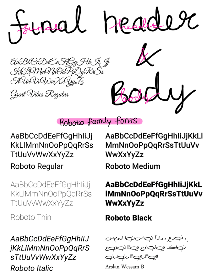
I chose the “great vibes” as the header because I wanted to use it for my cover and for the cover to have a sleek and elegant look so that font would convey it the best for my idea.
For the body text I wanted something very simple and that is effective. Due to the fact I wanted a lot of the attention to be on the information and the photography I took myself I went for the “robot” family font which gives that clean minimalistic style which is the aesthetic I wanted to initially go for.

Comments