Cover Page Evolution
- mumtasali
- Dec 2, 2021
- 2 min read
At first, we were quite hesitant when it came to the cover because we wanted it to perfectly represent what message we were trying to send through the rest of the magazine.
The first challenge was finding the perfect image for the cover. We wanted the magazine to give the audience an insight into the hijab and its importance.
However along with that we wanted the cover to fit our aesthetic which was minimal but also aesthetically pleasing.
At the end we went for this beautiful purple aesthetic for the cover. It’s a beautiful image displaying hijab fabric showing the folds and creases which enhances the beauty of the fabric itself. We were able to capture this using hijab material we have at home along with all the photography in this magazine being our own.
After deciding on the cover image, it was a matter of choosing the right font and what kind of front cover design we wanted. When choosing this we wanted to accentuate our existing aesthetic as much as possible.
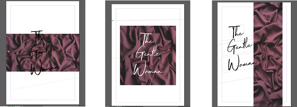
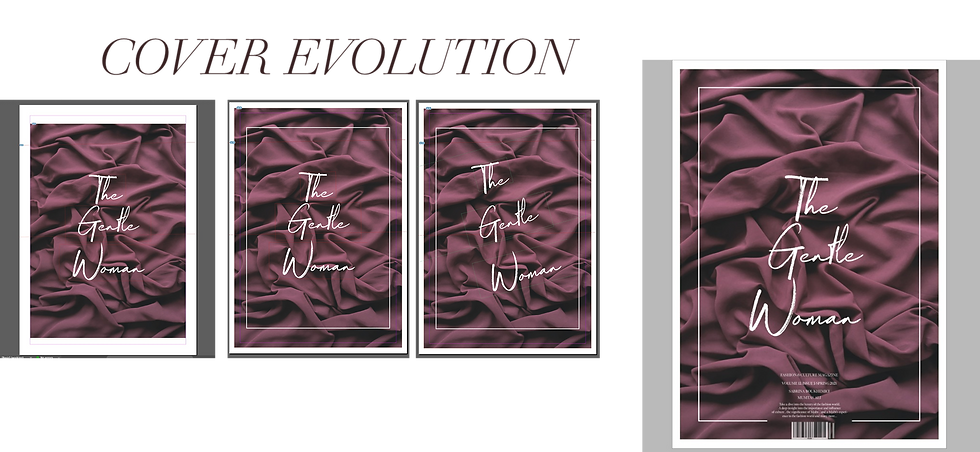
As for cover designs, we experimented with them using both black and white fonts however we concluded that white looked aesthetically pleasing and matched our aesthetic better than black. We also decided that we wanted the full page on the cover, but we added a thin white border around the text which made it look very professional but also minimal which was our goal for our set target audience.
When it came to choosing appropriate fonts, we knew we wanted a script font for the front page because we wanted to stick to the chosen aesthetic and use anything to accentuate it. We choose the font "Magnetic italic" because we wanted something that was aesthetic but also went well with the cover image.
Once it came to placement of the font, we experimented with the font placing it as an italic, straight down or slightly rotated but we decided that having it straight down looked better and went better with the border.
Overall, I am happy with the outcome of the cover page, we did our research thoroughly and made sure everything linked to our aesthetic and target audience. We paid attention to small details because the smallest details can have the biggest impact. I honestly think we did a really good job with the cover because everything was carefully considered and calculated so that it could reach our standard of work.


Comments